- hyphen minus ﹣ small hyphen minus - full width hyphen minus − minus sign soft hyphen (yeah, there's an invisible hyphen) ‐ hyphen ‑ non-breaking hyphen ‒ figure dash – en dash — em dash ﹘ small em dash ― horizontal bar or quotation dash ⁓ swung dash (which is not a tilde) ⸚ hyphen with diaeresis ⸺ two em dash ⸻ three em dash ⹀ double hyphen (not an equal sign) ゠ katakana double hyphen 〰 wavy dash ︱ vertical em dash
The possibilities are endless! Well, finite, but way larger than you'd think.
@f4grx@Dangerous_beans@iris@LilahTovMoon you have discovered the typographical representations of the German Breitmaulfrosch / Spitzmaulfrosch dichotomy, congrats!
@Dangerous_beans@iris@LilahTovMoon Not sure, but ⹀ is how you would hyphenate in handwriting (at last as taught in schools), which has the advantage over a hyphen of clearly not being originally hyphenated.
miss @Dangerous_beans , mr @iris , miss @LilahTovMoon : don't know about all of these but ‒ (U+2012 FIGURE DASH) is actually really nice as its ment for use within a number (ex the separator in phone numbers) . in fonts with same width digits , the figure dash should also have that same width . you may observe that "0‒1‒2" may look better spaced out than "0-1-2" (hyphen minus) , "0−1−2" (minus sign) or "0–1–2" (en–dash) , this of course depends on your font
@drj@LilahTovMoon@Dangerous_beans other replies got it -- it's a way to abbreviate pluralization rules, where the plural of a noun takes an umlaut the singular didn't have, e.g. Tochter (sgl) / Töchter (pl)
@Dangerous_beans@synec@iris@LilahTovMoon High Tech Metal Alloy genres, where the guitars all have more than the usual number of strings, and the time signatures aren't always 4/4
@iris@LilahTovMoon@Dangerous_beans when 2 german words with are hyphenated together, if the first is ending in an umlaut and the second is starting with one, then the hyphen needs to be umlauted aswell
@LilahTovMoon@Dangerous_beans Also, Katakana-Hiragana Prolonged Sound Mark which is not a dash: ー [edit: is actually a "letter", and can be used inside hashtags]
@LilahTovMoon@Dangerous_beans a few more: ー katakana-hiragana prolonged sound mark ー Halfwidth katakana-hiragana prolonged sound mark 〜 Wave dash (different from a fullwidth tilde: ~ )
(I'm on my phone so some might've been mangled but those are the full Unicode names)
@andrewt@gfaster@Dangerous_beans if you're on macOS, it's pretty easy 〜 the emoji keyboard also lets you search for random unicode characters as well as emoji
The pipe symbol (|) on IBM keyboards originated from early ASCII and character set standards, evolving from a logical "OR" symbol into a broken bar (¦) before returning to a solid line on modern displays and keyboards
Some or all if these are not really the pipe symbol 🫤🤷♂️
This also led me to track down what font the Mastodon SW on this site is using which actually *displays* all of these. It must be very up to date on Unicode symbols.
WRONG: Roboto Regular, it turns out.
CORRECTION: It appears it's actually Microsoft YaHei that has all of these; Roboto is missing a number of the cool ones like the 2 em- and 3 em-dashes.
@autistic_enby@LilahTovMoon@Dangerous_beans Actually in British English an aside might use spaced en dash,, US might use unspaced em dash. The em dash would be for cut of speech. But there is huge variation and house styles. A quotation wouldn't use dashes.
@autistic_enby@LilahTovMoon@Dangerous_beans That's a author for a quotation, not the quote. Yes, I use an em dish with no space for that, but if it's a preamble it will not have quote marks.
A style guide helps consistency as there is often no single correct usage. Nosy vs nosey, single or double quotes for dialogue. I think British & Irish English is more flexible than the USA. Webster is prescriptive, Oxford reflects usage.
I like to keep it simple, so I only use - – — in regular text.
@LilahTovMoon@Dangerous_beans Structure purist: the em dash (—) is a dash Structure neutral: the underscore (_) is a dash Structure rebel: the dash symbol (💨) is a dash
@LilahTovMoon@aldeka@Dangerous_beans There are so many colours in the rainbow So many colours in the morning sun So many colours in a flower And I see every one. — Flowers are Red, Harry Chapin, on Living Room Suite.
Probably haven't listened to it for 30 years, but still remember the lyrics.
@LilahTovMoon Yet all I wish for is a web browser and and iOS keyboard that let me type a non-breaking space (doesn’t even need to be the thin one) to put before :;!? in French. @Dangerous_beans@blinry
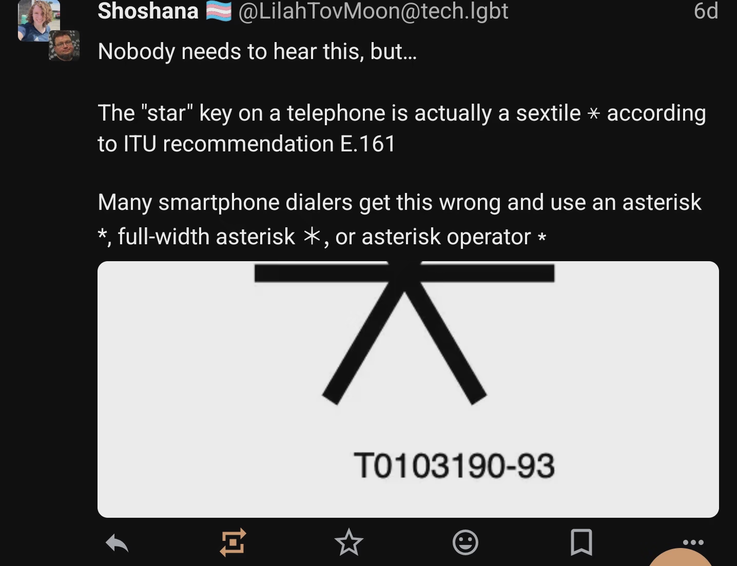
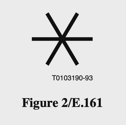
@xethos Oh, it's still known as "star" in language. It's just the typographic symbol that's a sextile.
And the octothrope is meant to be known as "square", but they note:
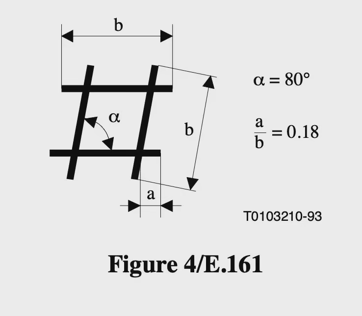
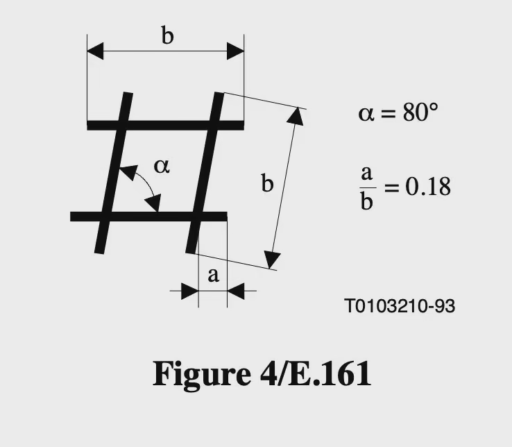
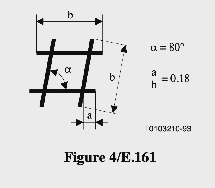
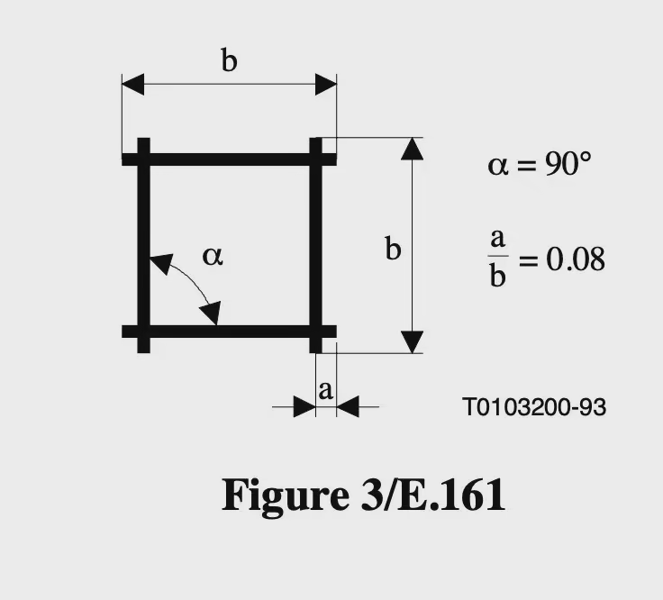
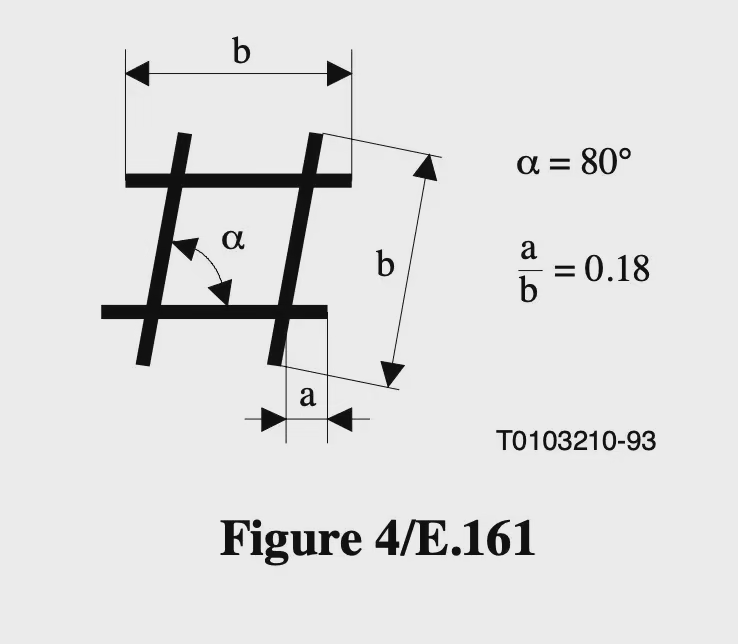
In some countries an alternative term (e.g. "hash", "pound" or "number sign") may be necessary for this purpose, particularly where the form in Figure 4 is commonly used
@LilahTovMoon next thing we know we're gonna find out that the number sign, hashtag, and octothorpe are somehow distinct unicode characters that are imperceptibly different
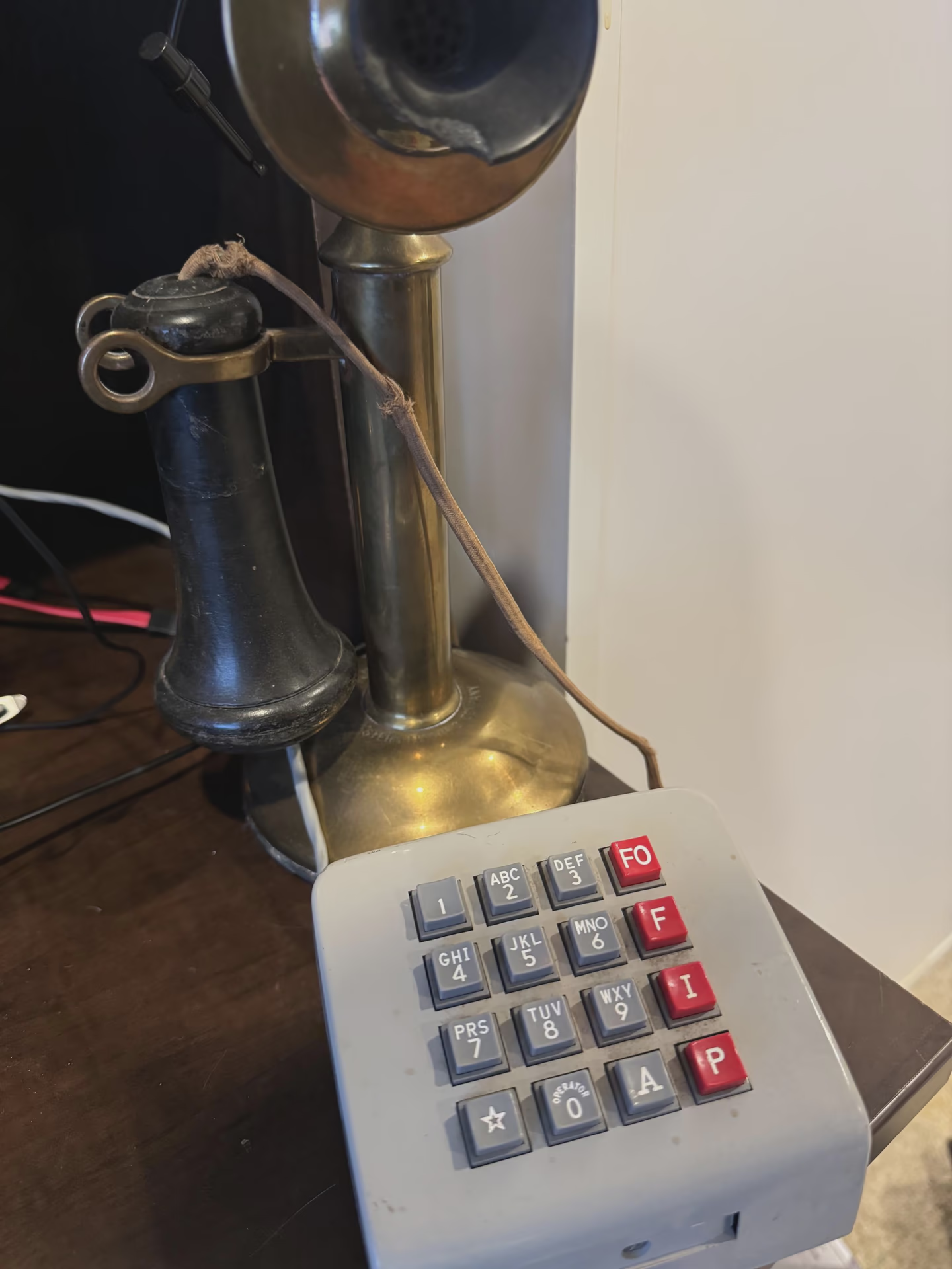
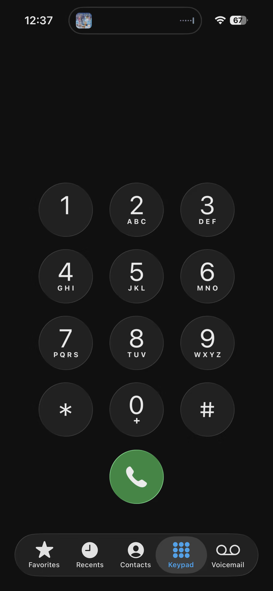
DTMF has a sixteen key variant, a fourth row with A, B, C, and D. I have heard tell of it being used for call priority on military lines, but nowhere else. That's a set of letters that could also be distinct
A touchtone keypad, except it has 16 keys. The right column is bright red and labeled FO, F, I, and P. The asterisk and octothorpe keys are also replaced with a star and an A.
A brass candlestick phone sits in the background.
@LilahTovMoon Oh this is exactly the kind of trivia I want and need to hear. Thanks, I did not know this. Immediately went to check my Android dialer, and it has an asterisk. Shame on Google.
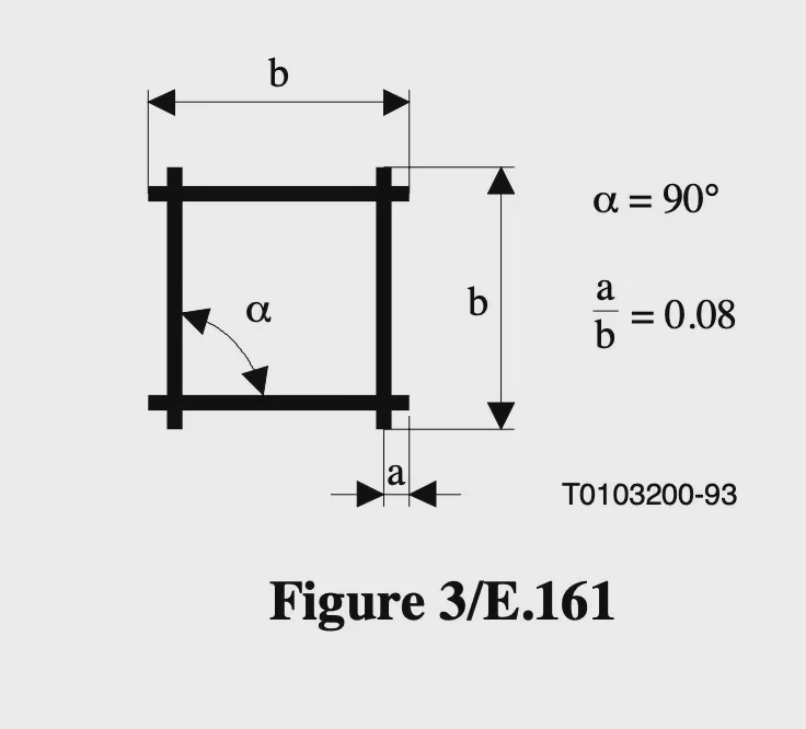
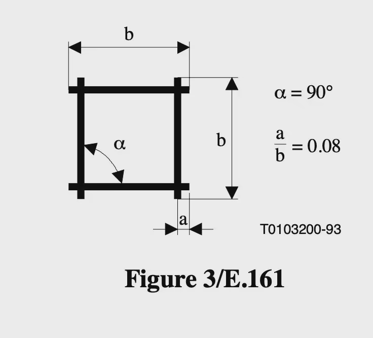
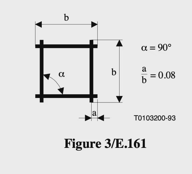
@LilahTovMoon How do you come to the conclusion that an asterisk is wrong? Wikipedia mentions US patent 3920926 https://patents.google.com/patent/US3920926A/en which says “sextile or asterisk”. There's a PBX Software called “Asterisk” named after the key. And ITU rec E.161 https://www.itu.int/rec/T-REC-E.161 explicitly calls Figure 2/E.161 a “Star” (which is another name for Asterisk according wo Wikipedia) and doesn't mention the words Asterisk or Sextile.
@Tourma Officially, it's called "square", but they note:
In some countries an alternative term (e.g. "hash", "pound" or "number sign") may be necessary for this purpose, particularly where the form in Figure 4 is commonly used
@lennby@Tourma I'm on team square, the official name of the key.
Though the ITU does note:
"In some countries an alternative term (e.g. "hash", "pound" or "number sign") may be necessary for this purpose, particularly where the form in Figure 4 is commonly used"
Using "octothorpe" is definitely a rebellion against the International Telecommunication Union
@LilahTovMoon I kind of wonder if that's actually in an ISO standard like ISO 7000 ("Graphical symbols for use on equipment - Registered symbols").
(And I don't want to pay up my nose to get a copy of ISO 7000 and check if telephony symbols are there. I know e.g. the automotive dashboard symbols are there.)
MEME_LOTR_SECOND_BREAKFAST( "What about the standard?", "You already have the ITU standard.", "Aye, we have the Industry Standard.", "But what about the International Standard?" )
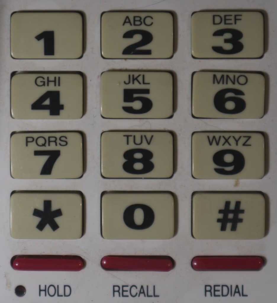
just checked a British Telecom 8782 (DTMF variant of 700 series) and a Viscount I happen to have close to hand (as well as a newer Motorola long distance DECT handset) and they do all have the correct star, whereas Android diallers just use a * from the normal character set..
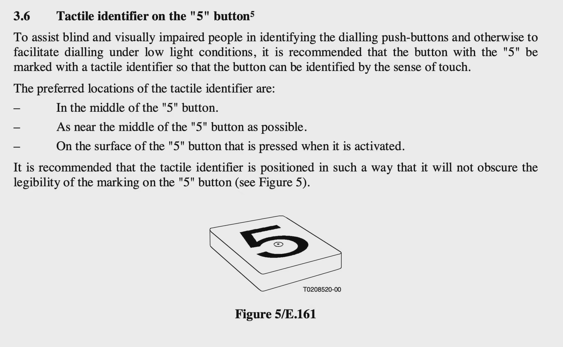
ITU recommendation for a tactile identifier on the "5" button
To assist blind and visually impaired people in identifying the dialling push-buttons and otherwise to facilitate dialling under low light conditions, it is recommended that the button with the "5" be marked with a tactile identifier so that the button can be identified by the sense of touch.
The preferred locations of the tactile identifier are:
– In the middle of the "5" button.
– As near the middle of the "5" button as possible.
– On the surface of the "5" button that is pressed when it is activated.
It is recommended that the tactile identifier is positioned in such a way that it will not obscure the legibility of the marking on the "5" button (see Figure 5).
It includes a figure of a "5" button with a raised tactile dot
@w8emv That's officially known as "square", but they note:
In some countries an alternative term (e.g. "hash", "pound" or "number sign") may be necessary for this purpose, particularly where the form in Figure 4 is commonly used
@w8emv That's officially known as "square", but they note:
In some countries an alternative term (e.g. "hash", "pound" or "number sign") may be necessary for this purpose, particularly where the form in Figure 4 is commonly used
@LilahTovMoon Long ago I worked for a British company which was pretty well distributed around the world, but higher concentration in the UK and US. I remember the conference system would ask me to "please dial the extension, followed by the pound or hash key". Every single time I would reply to myself "oh boy, I get to choose which one!" It never got old.
@LilahTovMoon Thank you for featuring one of my minor but very persistent pet-peeves.
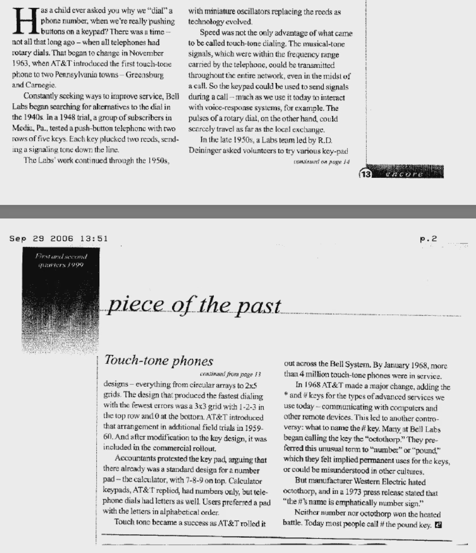
While I have your attention, dear reader, have you ever wondered what the # sign on the key opposite the sextile is called? like… really, by the people at Bell Labs? Octothorp! Here's why:
A fax of a copy of an article in "encore". The salient bit is this:
We finally decided in a jocular way to call the pound sign an “Octotherp”. That was because it had eight points and “therp” sounded Greek and also seemed to go well with the “octo” portion of the word.
@LilahTovMoon things like this is why I hate most fonts!
My current one shows the asterisks (and asterisk operator) as five-pointed, with a bar vertical to the top. Sextile is six-pointed (obviously) with horizontal bar.
But the full-width-asterisk? six-pointed, with vertical bar! WHY‽ Why not just make asterisk "full-width", so larger?
And don't even get me started on how asterisk and asterisk operator look near identical, but not 100%? You'll never see what's what unless both are right besides each other, but they still bothered to do different glyphes?
It's just 4 near-identical glyphs with one indicating "I should be bigger" in the name. And there's like 4+ WTFs.

 — Open image attachment 1 of 1









 )}]
)}]

 🍵
🍵



































 ... not to mention that almost no soul knows what an asterisk is and yes it has a connection to Asterix.