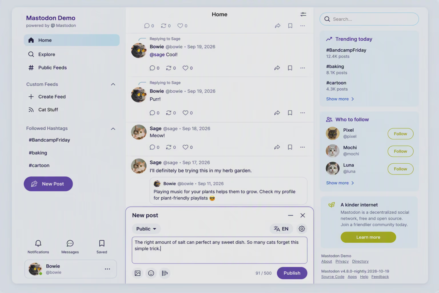
#Mastodon is getting a new look in our upcoming 5.0 release.
We wrote a bit more about our design process and how we approach community input. If you’re on mastodon.social you will see the new design tomorrow, on Tuesday. We rely on your feedback!
@tuneintodetuned@Mastodon We still use Zulip internally, but figured out that Discourse would be a better platform to engage with the broader community
@WeirdWriter@Mastodon Software can be modified to do things it doesn't support natively ;) Also at least an ActivityPup plugin exists for Discourse already, not sure if that allows login/posting too but would be a good feature to add if not.
@max@WeirdWriter they could have used a forum like NodeBB—which is fantastic and fully federated—but doing so would have meant the Mastodon staff giving a highly significant nod of recognition to one of the best-developed software projects of recent years—a platform free from all the artificial limitations that Mastodon users are still forced to contend with.
@Mastodon Seems like all categories are about "the app". It that the *mobile* app, or does that cover the *web* UI? And if not, then what category should I use to report something about the *web* UI?
It works! It has given us the oldest running archives of open source discussions. Nothing stuck in some db schema nobody will bother to parse in 15 years.
@mbootsman@Gargron@Mastodon Ohh sorry, I thought that was a statement instead of the heading you wanted to be adjusted … maybe use quotation marks next time?
why is 1/3 of the screen completely empty? does not look good :(
feedback:
you want to move the posting box, sure ok. but don't move everything over to the left side, leaving the right side completely empty - until there's a UI/UX purpose for it
yeah i see, thanks. moving a bunch of stuff to the opposite side and leaving the space completely empty seems like a bad design choice to me, but hey i just use it
for sure. but a UI is very personal and when it feels awkward, that can and will turn people off. i have to stand in front of people who don't use Mastodon and convince them this is a better platform than Twitter
@Mastodon Thank you for finally addressing this issue, I think calling them "likes" and using a heart icon is way nicer, and most people nowdays will understand it way better!
@raph@Mastodon Pas fan de la proposition pour le Post Composer MAIS sinon 10/10 on rentre vraiment en phase avec notre ère ! Enfin de la modernité ! J'adore et hâte de voir le rendu en dark mode !
@Mastodon@mastodon.social Not a fan of showing metrics for likes and boosts on the timeline. Imho. this is a feature and not a bug of Mastodon, encouraging me to judge the content on its own merits and not on engagement metrics.
@Mastodon "We’re headed towards more roundness to invite a friendlier brand tone, and to make Mastodon feel more native within modern browsers (most of which have adopted a rounded aesthetic)."
Oh, FFS, first it's Firefox that have fallen for this and now its Mastodon.
@Mastodon I like the overall design. But I don't like the use of color. Mastodon only has versions of violet in its' color scheme. To me it's lacking secondary colors for accents and to really show a hierarchy of elements. Although I don't realy like the violet as it makes everything look sad, I accept that it is the established color for mastodon. But there should be complementary secondary colors that are not just a variation of the primary color. And making the base-color freely definable doesn't make it better. I am not a designer, but it could look far more friendly and happy with a touch more color.
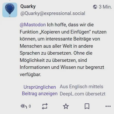
@Mastodon I hope we will be able to copy and paste, to allow translation of interesting posts in other languages from people around the world. Information and knowledge is limited without being able to translate.
@kaffeeringe@Quarky@Mastodon it doesn't always appear, has to have the language of the post set correctly (and to a language different from your used one) and LibreTranslate is unfortunately mostly useless. Copying and pasting text is unfortunately quite important.
@kaffeeringe@Quarky@Mastodon That's a choice of the instance (and I guess it isn't the choice of some because it's not free). As a user I have to get around LT manually.
@Mastodon I'm already on nightly; the new design looks great, and everything works as expected (as far as I can tell). I'm happy with the new popup composer. Thank you for providing amazing software all these years!
@Mastodon But why put the composer at the bottom center instead of just the top? Newer posts are usually added on top, so why should I add mine at the bottom?
Wouldn’t that also be more aligned with this statement?: “Whenever possible, we’ve based the redesign in existing UI patterns used frequently across the web, […]”
@Mastodon Notifications should really not be at the bottom left on desktop web sites when traditionally their place is the top right across tons of sites/programs/games. (as the gaze naturally is at the top part of the screen, important information like notificatiors should be there too)
@Mastodon I like it! Generally a good step in the right direction. Maybe you already have planned ahead for future additions, but at the moment the right column looks very empty with all the space it's using up. It makes the visual distribution feel out of balance right now.

 1



























 et hâte de voir le rendu en dark mode !