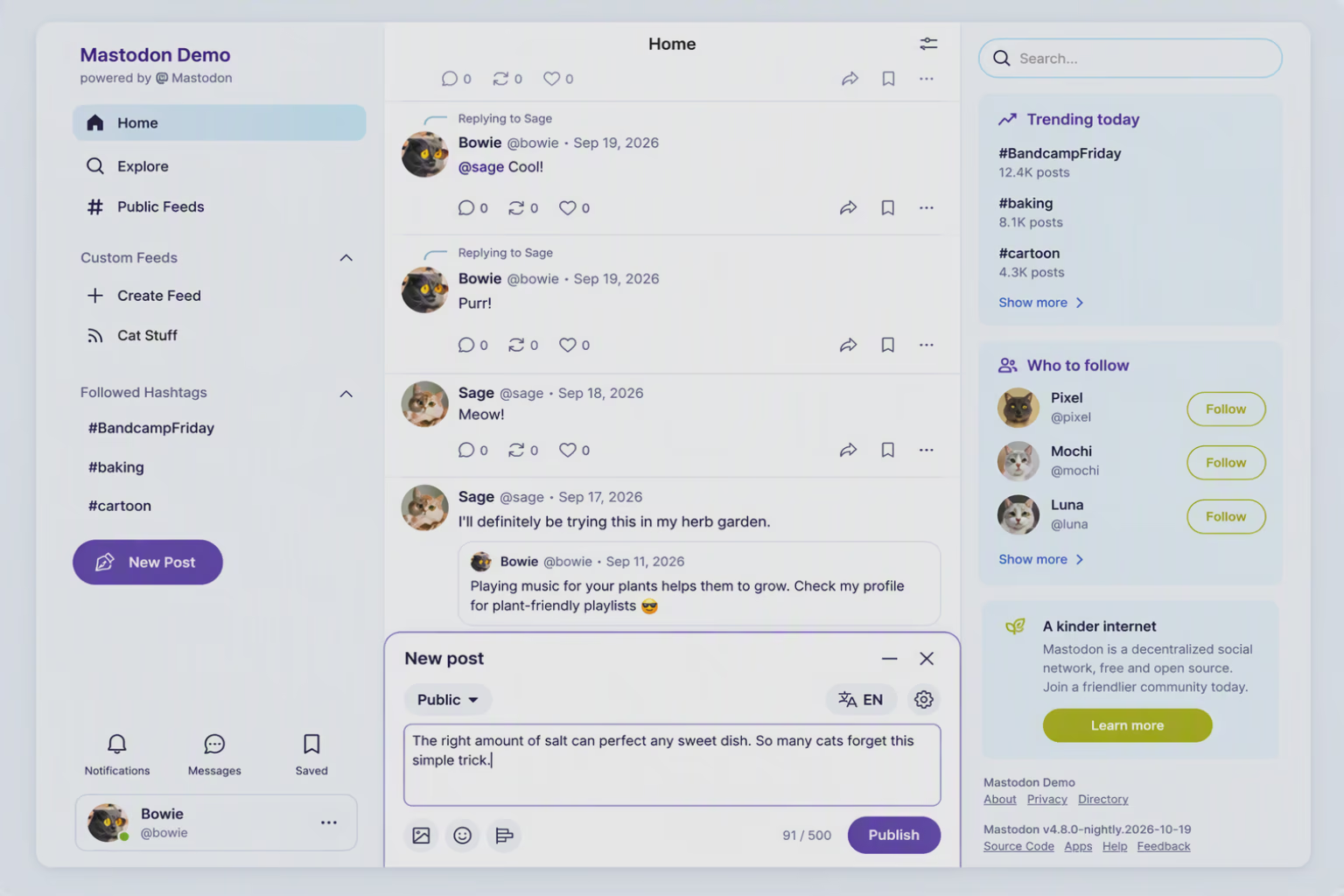
#Mastodon is getting a new look in our upcoming 5.0 release.
We wrote a bit more about our design process and how we approach community input. If you’re on mastodon.social you will see the new design tomorrow, on Tuesday. We rely on your feedback!
https://blog.joinmastodon.org/2026/10/5.0-a-closer-look/
blog.joinmastodon.org/2026/10/5.0-a-closer-look/ 1