posted in Selfhosted

GitHub Has an Availability Problem. Is It Time to Look Elsewhere?
dhruv2038.bearblog.dev/github-has-an-availability-problem-is-it-time-to-look-elsewhere/posted in Selfhosted
GitHub Has an Availability Problem. Is It Time to Look Elsewhere?
dhruv2038.bearblog.dev/github-has-an-availability-problem-is-it-time-to-look-elsewhere/Yeah it was completely useless today.

The right time to look elsewhere was when Microsoft bought it.
The next best time was when viable alternatives like GitLab and later, Codeberg appeared.
The next best time was when it became clear that they were stealing your code to feed into their sparkly autocomplete and were going to sell it back to you.
The next best time was when they dumped a bunch of vibecoded garbage into the codebase and killed the uptime.
The next best time is now.
You don’t even have to migrate all your stuff. Just start all your new projects on Codeberg, or GitLab, or something self-hosted. Once you get used to the new place, you can migrate your old stuff when you’re ready.

This is exactly it, Microsoft always makes things about themselves. They change everything, mostly for the worse.
Comments like this are so frustrating to see, as my company goes backwards, moving from Gitlab to GitHub.
I mean, didn’t Gitlab also say they were going all-in on AI?
There’s no major forge you can use for proprietary projects that isn’t shitty.

Forgejo, if you self host it, you can use it for propietary projects
(And it’s as easy as deploying a docker container and hitting start, really)
Yes, but then you hold all the liability for your shit going missing. The entire point of using a managed service like github or gitlab is that you have someone to sue.
VPS then, the alternative is a ““free”” corporate thing or some project mantaine by either donations or someone who has money and doesn’t know how to spend 'em
Don’t remind me …. The doublespeak at my company …… we had to use GitHub for the built in AI, but couldn’t even evaluate GitLab’s AI because it costs extra
Codeberg/Forgejo also have a simple button to migrate directly on the web UI

GitHub Has a Microsoft Problem. Is It Time to Look Elsewhere?
Breaking: Water is wet. Read the in-depth analysis on why you should have gotten a boat years ago and why you should still get one now!
But wait, there’s more: a gigantic colony of Microtards that don’t understand why the water is wet, and they don’t care!
More news at 11.
Any alternatives with a good UI? Really don’t like the ones for codeberg or gitlab tbh, and GitHub is bearable

What do you find bad about Forgejo / Codeberg’s UI?
For forgejo I’m actually not too sure - “feel” is vague but the best I’ve got, maybe someone more UI inclined has clearer thoughts on it. Or maybe I just need to get used to it. It’s certainly much better than Gitlab imo.
It’s old Github UI
Well of the major options out there that’s not github you’re looking at gitlab, forgejo/codeberg, or sourcehut. Sourcehut is the most minimalistic UI so you may love it or hate it. Otherwise i personally would value open source over UI which is why i use codeberg.
Replying to @_hovi_@lemmy.world
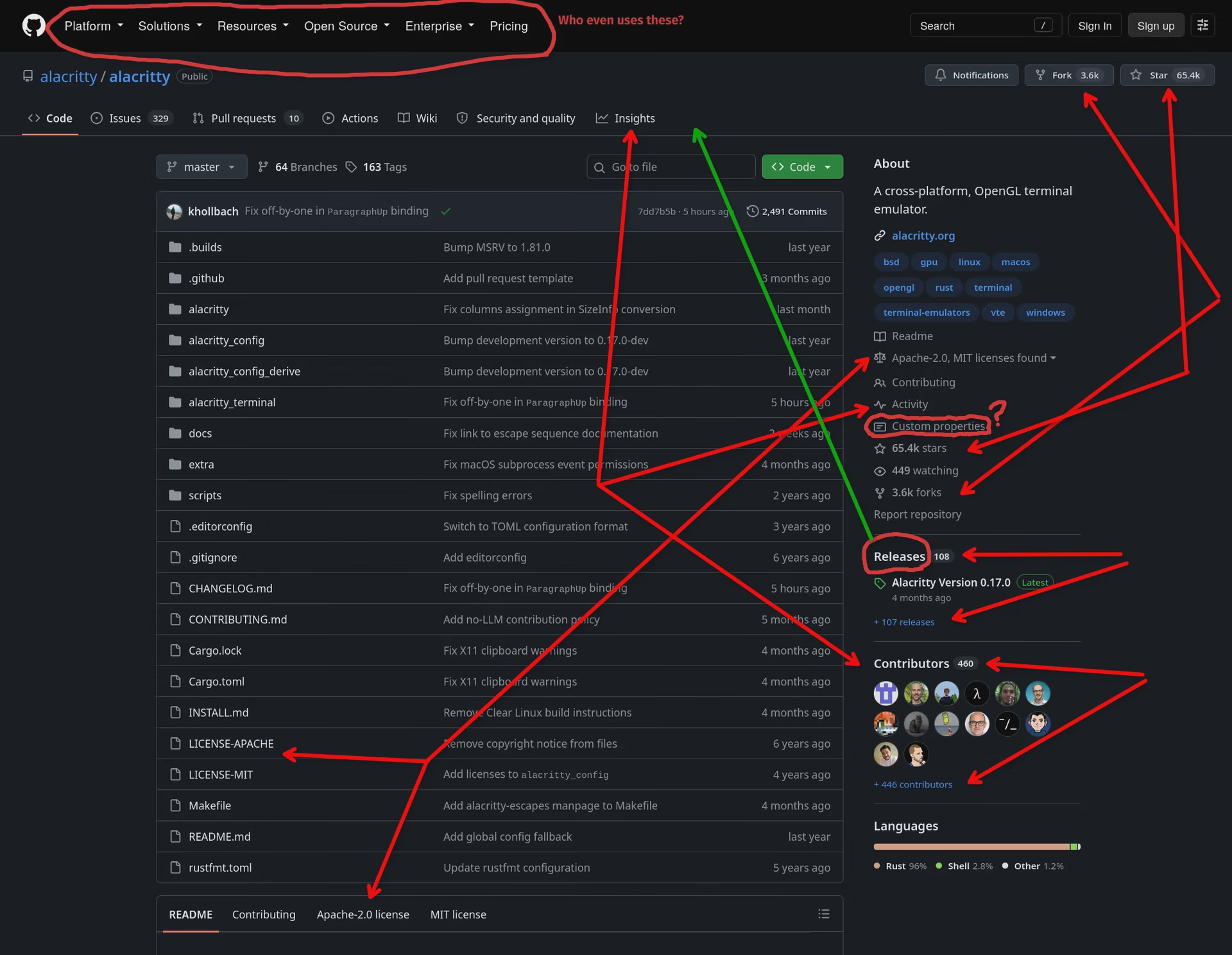
I could rant a lot about the GitHub UX, so here’s just the fairly obvious stuff on the repository page:
Red arrows mean duplicated information or duplicated navigational elements.
Green arrow means why the fuck do I have to tell our customers to click a random link in the middle of bumfuck nowhere, in order to download our software?

Replying to @trem@lemmy.blahaj.zone
Unpopular opinion, but most of that is duplicated information that makes sense to be duplicated because I’m not a machine that can scan the whole page and instantly get what I need.
Top right are action buttons, fork and stars on the center right let you see who else starred and forked the repo.
License information just makes sense to be in a repo summary, and it just happens that most license files are at the root and visible in the file tree.
I don’t see the top level stuff, you probably see that because you’re not authenticated, so github tries to “sell” itself for you.
I agree “releases” should be at the top though (it used to, and I use GitHub refined to bring it back), but having the latest one at a glance is nice and saved me a click many times.
I mean, yeah, it can make sense to duplicate information. That screenshot isn’t supposed to say that all of these should be deduplicated.
But you really gotta be cautious with duplication, because it makes everything else harder to find. And I would absolutely argue that GitHub has crossed the line where they duplicate too much, across the board. It feels like design-by-committee.
This is entirely anecdotal, but what really dumbfounded me while annotating that screenshot, is that I never actually read the links in that “About” section.
I’ve seen this page probably a thousand times already, but I had no idea that there’s an “Activity” link there, which actually seems like it could be useful. Nor a link to the README, to the CONTRIBUTING.md or for “Custom Properties” (whatever that is).
I had no idea how to report a repo until now, even though the link is apparently always on screen.
There’s just so much info there, and it’s presented like read-only info, not like navigation links, so I always just skipped over the lines that don’t have numbers in them. I also genuinely never tried clicking any of these lines before…
Note that the top “ribbon “ is visible from all of those ribbon choices, while the content pane stuff, like the “About” box are only visible in “Code”
Yeah? You should still make a decision. If you want it possible to watch, star and fork the repo from any of the sub-pages, then that stuff has to live in that top ribbon.
But then you shouldn’t duplicate it into the Code sub-page. I’d work with split buttons, where you can look at who starred and you can add your own star, all from the same UI element. It would not even take up more space, since they do already display the count in the top ribbon as well.
Apparently this is how Codeberg does it (see e.g. this repo), so this might be where I have the idea from…
Honestly, for me the Forgejo/Codeberg UI is the best out there, I actually like it even better than GitHub. I think you just need to get used to it. If you had been using Codeberg the last 10 years and just discovered GitHub today, you’d take one look at it and say the UI is bad.
Maybe yeah
Self-hosted Forgejo works well for my own use. My employer is moving to GitHub Enterprise where it’s a separate instance per company with certain infra shared. Should be a slight improvement, I guess, though probably not a bad idea to make sure internal tooling is built with the git forge being configurable. 😉
I’ve been eyeing Gitea. Do you have any reason for using Forgejo that I might overlook Gitea in favor of it?
I used to run Gitea and switched to Forgejo mainly because I prefer a community project over one run by a for-profit company. I never had any substantive complaints against Gitea during my time with it to be honest, but thought I’d get off of it before investing too much further in case it went in a bad direction.
That is a solid enough reason and one I wasn’t aware of. Exactly the kind of thing I was hoping to find out, thank you!
The transition of gitea to chasing profits was pretty messy too iirc and motivated the forgejo fork. Gitea lost a lot of good-will back then. Forgejo is also the base that codeberg runs on now.

Moved to codeberg.org when that Microslop VP took over running github. I have nothing on the platform but my account so I can look at other stuff on the site.

Radicle radicle.dev
I’ve used. It works well enough. They supposedly have CI but either it’s not documented or nor ready, I can’t tell.
And there’s no way to get notifications of merge requests, comments or anything actually, so it serves well as a backup or private project host, but not much else, IMO.
I think it might just be that their documentation is dispersed, and sometimes hard to find. I haven’t used the CI, so I can’t comment on how well it works, but it appears to be in use: blog.liw.fi/posts/2026/radicle-status-quo-07/
Here’s some docs on it: radicle-ci-broker.liw.fi/userguide.html radicle.network/…/rad%3AzwTxygwuz5LDGBq255RA2CbNG…
Thanks for the links. Documentation is definitely a problem. They’d have to be open to feedback on documentation. Threads on documentation improvement are often met with “it exists, what more do you want?” even if the feedback is “this and this is missing” 🤷
Anyway, I’ll check out the links and try to set something up. My usage of radicle is definitely what it could be because of the lack of notifications. I literally fire and forget my repos, patches and so on, because I haven’t found an easy way to be made aware of responses or incoming patches.
Looks like you can setup notifications to Zulip at least radicle.network/nodes/…/README.md

Already migrated to gitea

Is your code free for others to do whatever the fuck they want to with it? : codeberg
Do you want to put certain restrictions (eg financial)? Gitlab

Replying to @Skullgrid@lemmy.world
Codeberg doesn’t allow you to use AI with your repos. Even if it is just writing your docs for you.
Radicle is decentralised though!
Yeah, I don’t think I have a codeberg going at the moment because I want to do CC4NC.
There’s like some scripts I don’t mind people making derived commercial works since they’re fucking tiny, but other than that, I don’t want people getting rich off my code.
I also have lots of scripts I find handy but would never share. I just need a safe third party to host it.
You can always self host forgejo, but yeah, codeberg is an opinionated place, I suspect primarily due to resource constraints. Not a github replacement and not really trying to be.
I do run a local instance but what I do is then replicate certain repos out to Github and Codeberg. (The ones I like to keep public)
Radicle is awesome, but having to create a new account for each device is a pain, especially if you want them all to have access to the same private repo.

Doesn’t allow you to use AI with your repos
You say that like it’s a bad thing, that’s a EXCELLENT THING, get the slop outta open source
Replying to @gwl@lemmy.blahaj.zone
That’s completely irrational but you do you. Maintaining documentation is one of the best and safest uses for LLMs in coding - devs generally write bad documentation because they don’t want to do it.
You say irrational, I say it’s rational not to trust the predictive text on steroids that often just makes shit up.
I say irrational because clearly there is a bias here and not an experience being referenced.
So you’re saying they never hallucinate? Ever?
I have evidence to the contrary;
https://www.businessinsider.com/microsoft-copilot-election-questions-misinformation-2024-2
https://cronkitenews.azpbs.org/2025/10/28/lawyers-ai-hallucinations-chatgpt/
https://www.envive.ai/post/case-study-of-air-canadas-chatbot
Literally just use doxygen. You don’t ever need LLMs for docu.
Replying to @lambalicious@lemmy.sdf.org
doxygen
There is zero chance for getting this approved to use in our Enterprise.
We have an existing tool that can do this without assessing another tool.
There is zero chance for a FOSS, offline tool that uses a decades-established formatting and annotation system, but there is 100 dicksuck on AI?
Wow… get your resume ready to migrate.
Correct, if we have something included in a contract we already have there is little reason for us to procure a FOSS tool and maintain a security understanding of said tool and maintain versions.
Organisation of 60K. Job is far too senior, lucrative and actually very enjoyable to consider moving over a puerile thing.
Federated git forges can’t come fast enough. Fuck gitlab for so willingly dropping the ball
Replying to @dhruv3006@lemmy.world
Am I the only one that needs to press F5 to get github to load after entering github.com in the browser? It only happen with github.
I filled out an IT helpdesk request last week because I couldn’t push any updates to GitHub. I was able to access the site, so I though my access token was retired since that happens every once in awhile.
Nope. It was GitHub. For some reason it couldn’t accept my push despite the website still being up. And I didn’t find out until the tech called the the next day and it worked when I tried to recreate it in front of them

Unicorn error!
But the big issue for me is the authwalls. I’ll migrate when we have a good replacement on the fediverse, when PRs and issue comments can be made from different instances
You might be interested in Tangled. Not sure if they’re stable yet though
Looks cool, but how do I browse existing repos?
Huh… I’m not really sure. I know I was able to a while back, but now I don’t see how.
Maybe it requires login now. I guess I wouldn’t be surprised if that’s a way to reduce AI traffic or something.
Kinda makes it seem like vaporware.
Anyway, I put my code online because I want it to be found. This kinda defeats the whole idea
There was a surprising number of repos there when I last looked, and their blog seems to show signs of life, so I don’t think it’s vaporware (at least not yet). But yeah, not easily being able to browse repos from the home page definitely sucks.
FWIW, you can see some recent activity scroll by from right to left on the front page, near the top, right below the hero section. You can click them to view some users and repos (example: tangled.org/mitchellh.com).
That’s the only way I see from the front page though, which is not great :/
We need decentralized forge such as radicle.dev to become more mainstream and people seeding tons of repo!

Replying to @dhruv3006@lemmy.world
I mean yes, Microsoft and slopcode probably plays a role, but it only got really bad once the LLM mass scraping started, for which I assume Github is also a major target.
And running your own public git forge is a real PITA these days for similar reasons.
Codeberg then
Apparently GitHub doesn’t allow adding people to private repos if you don’t pay, I switched to Codeberg after that