posted in Selfhosted

GitHub Has an Availability Problem. Is It Time to Look Elsewhere?
dhruv2038.bearblog.dev/github-has-an-availability-problem-is-it-time-to-look-elsewhere/posted in Selfhosted
GitHub Has an Availability Problem. Is It Time to Look Elsewhere?
dhruv2038.bearblog.dev/github-has-an-availability-problem-is-it-time-to-look-elsewhere/Any alternatives with a good UI? Really don’t like the ones for codeberg or gitlab tbh, and GitHub is bearable

What do you find bad about Forgejo / Codeberg’s UI?
For forgejo I’m actually not too sure - “feel” is vague but the best I’ve got, maybe someone more UI inclined has clearer thoughts on it. Or maybe I just need to get used to it. It’s certainly much better than Gitlab imo.
Replying to @_hovi_@lemmy.world
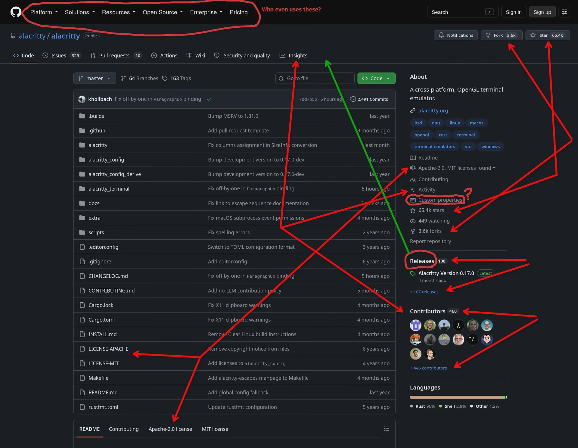
I could rant a lot about the GitHub UX, so here’s just the fairly obvious stuff on the repository page:
Red arrows mean duplicated information or duplicated navigational elements.
Green arrow means why the fuck do I have to tell our customers to click a random link in the middle of bumfuck nowhere, in order to download our software?
Note that the top “ribbon “ is visible from all of those ribbon choices, while the content pane stuff, like the “About” box are only visible in “Code”
Yeah? You should still make a decision. If you want it possible to watch, star and fork the repo from any of the sub-pages, then that stuff has to live in that top ribbon.
But then you shouldn’t duplicate it into the Code sub-page. I’d work with split buttons, where you can look at who starred and you can add your own star, all from the same UI element. It would not even take up more space, since they do already display the count in the top ribbon as well.
Apparently this is how Codeberg does it (see e.g. this repo), so this might be where I have the idea from…