posted in Technology

US coal ‘biggest contributor by far’ to rise in global emissions
www.thechemicalengineer.com/news/us-coal-biggest-contributor-by-far-to-rise-in-global-emissions/posted in Technology
US coal ‘biggest contributor by far’ to rise in global emissions
www.thechemicalengineer.com/news/us-coal-biggest-contributor-by-far-to-rise-in-global-emissions/
Replying to @Mustachius_Grumpius@thelemmy.club
From the article: “Make no mistake: China is still by far the biggest CO2 emitter in the world” in absolute terms, Law stressed.
Replying to @How_do_I_computah@lemmy.world
It’s also the biggest country in the world by population, by far. That’s not really indicative of anything. China is also decarbonizing at an absolutely incredible rate, whereas the US are basically doing everything they can to increase their emissions.
Replying to @Voroxpete@sh.itjust.works
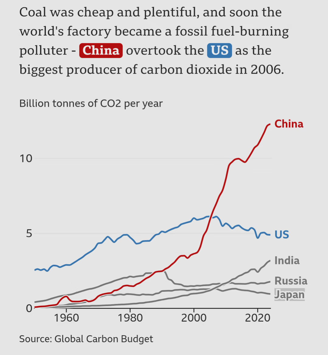
. You’re right. If you look at the China line on the graph it IS starting to turn around.

Replying to @How_do_I_computah@lemmy.world
You know it’s fun how that same graph has been showing up re-labeled for 20 years. Like you can even see where the edits have been, but go off fam.
Replying to @GreenBeard@lemmy.ca
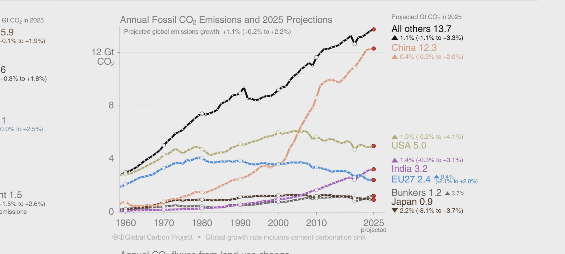
The latest release from the Global Carbon Budget is 2025 predictions, here:
I think what most people forget/like to ignore is how nearly all manufacturing from Western countries has been offshored to China, I’ve no idea how things would look if this hadn’t happened.
Replying to @monketman82@lemmy.world
I think that’s kind of a slippery slope. What would the USA or Japan line look like if you didn’t count all their exports either? I say let China be responsible for the China line and USA be responsible for the USA line. After all USA doesn’t tell China how they should power their factories.
Replying to @How_do_I_computah@lemmy.world
Proper accounting of emissions is to attribute it all to consumer. They won’t make it, and ship it all the way here, if you don’t buy it. The graphs don’t do it this way.
Replying to @monketman82@lemmy.world
Thank you, I appreciate accurate data. I hate engaging with Instagram memes.
Now, if you’ll notice, this graph hasn’t actually had a full data refresh since 2024, which is fair, because real data analysis takes time, however, you’ll also note that the rate at which China has pushed forward with decarbonization has exceeded projections in the latest preliminary datasets. Now whether those datasets are reliable or not is unknown but we DO know that since the 2024 election, the US rate of fossil fuel emissions has spiked, which again would not be captured in a model based on 2024 data.
Which is what the original post was about. Recent preliminary data suggests US fossil fuel consumption has spiked hard in the US and is rising. So I’m not even sure what the guy who posted the Instagram meme intended to prove.
Replying to @GreenBeard@lemmy.ca
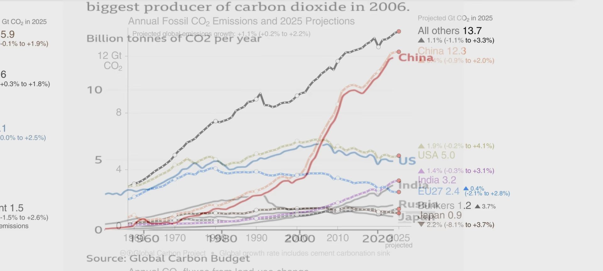
It’s the same graph from the same source.
Look at the bottom left of the original image.
Replying to @How_do_I_computah@lemmy.world
The original image is a fake. That’s been floating around for years, with different years slapped on on it, different labels for various countries, and different headlines attached.
It. Is. A. FAKE. You want real engagement, post real information.
Replying to @GreenBeard@lemmy.ca
Dude! It’s the same fucking graph!