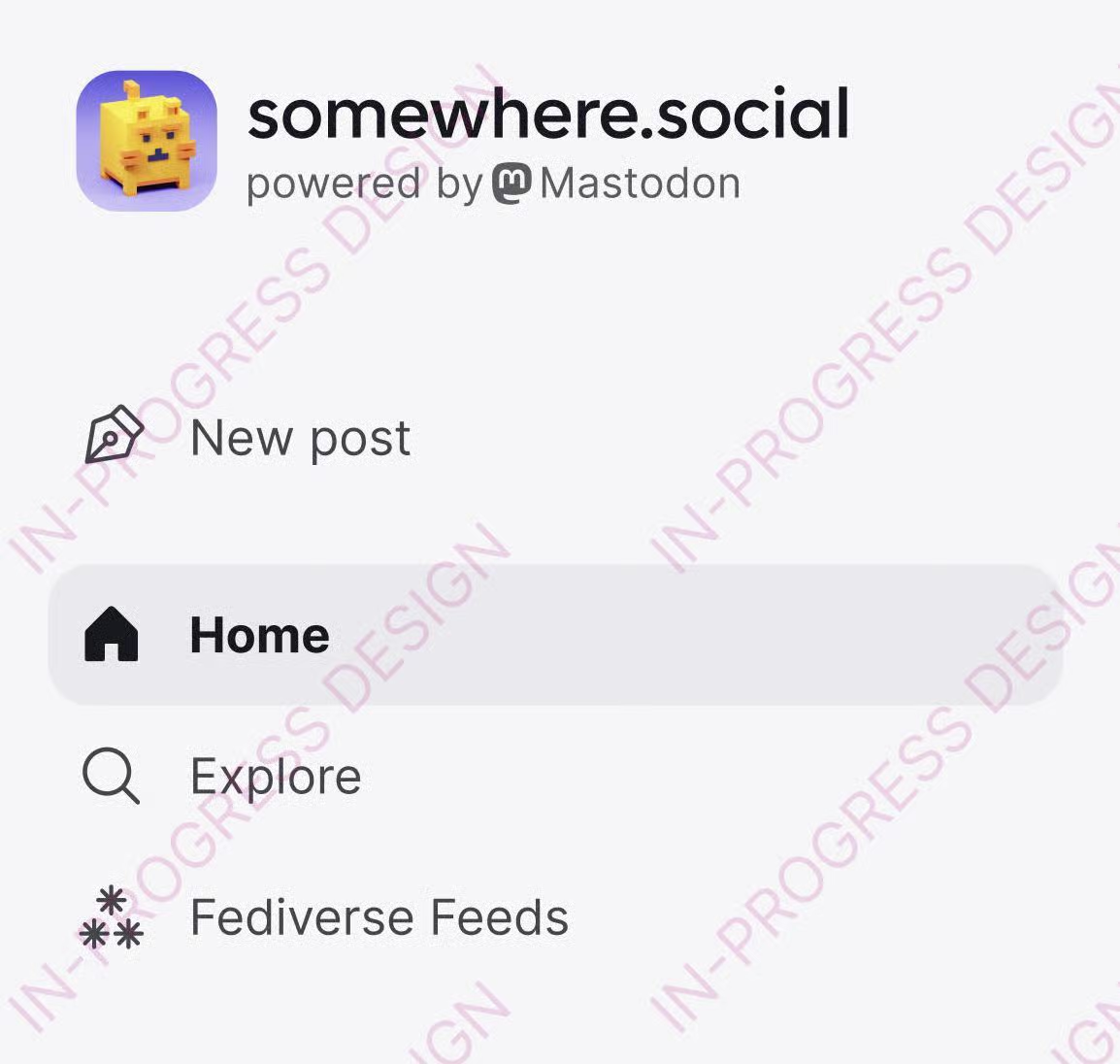
After publishing the results of Discovery Week, we can now give you a first sneak peak at Mastodon 5.0, our next big version. It will bring a new visual look to your screens, a refreshed and calmer layout, as well as a new composer.
https://blog.joinmastodon.org/2026/08/5.0-laying-the-foundation/
blog.joinmastodon.org/2026/08/5.0-laying-the-foundation/
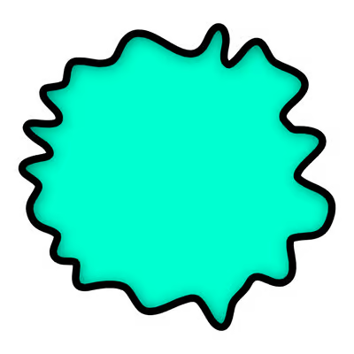
 symbol not working without the rainbow color and there not being any good solution to solving this. there are many cases (like this one) where a multicolored symbol simply does not work