
Replying to @LilahTovMoon@tech.lgbt
@LilahTovMoon things like this is why I hate most fonts!
My current one shows the asterisks (and asterisk operator) as five-pointed, with a bar vertical to the top. Sextile is six-pointed (obviously) with horizontal bar.
But the full-width-asterisk? six-pointed, with vertical bar! WHY‽ Why not just make asterisk "full-width", so larger?
And don't even get me started on how asterisk and asterisk operator look near identical, but not 100%? You'll never see what's what unless both are right besides each other, but they still bothered to do different glyphes?
It's just 4 near-identical glyphs with one indicating "I should be bigger" in the name. And there's like 4+ WTFs.
My current one shows the asterisks (and asterisk operator) as five-pointed, with a bar vertical to the top. Sextile is six-pointed (obviously) with horizontal bar.
But the full-width-asterisk? six-pointed, with vertical bar! WHY‽ Why not just make asterisk "full-width", so larger?
And don't even get me started on how asterisk and asterisk operator look near identical, but not 100%? You'll never see what's what unless both are right besides each other, but they still bothered to do different glyphes?
It's just 4 near-identical glyphs with one indicating "I should be bigger" in the name. And there's like 4+ WTFs.
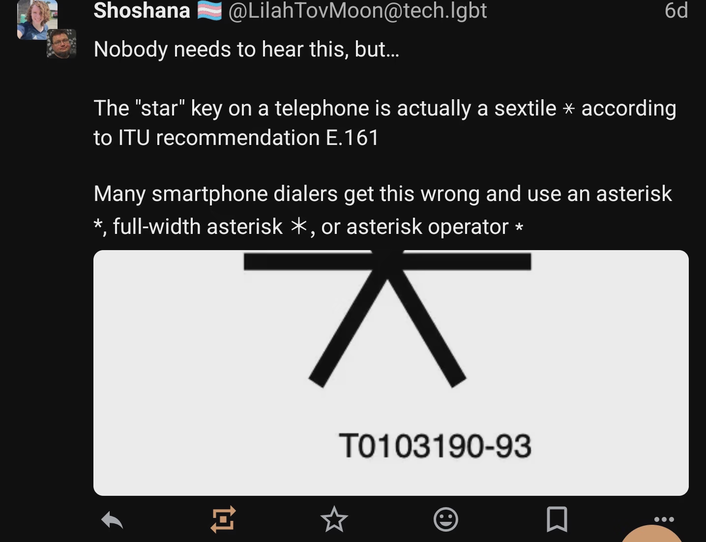 — Open image attachment 1 of 1
the post I replied to, as seen on my phone with my current font