Ugh, I thought we were getting over this already.
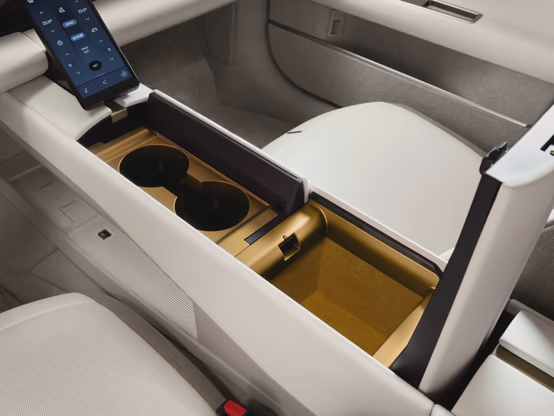
The interior is fine, I can appreciate the clean lines and overall minimal ornamentation. White is probably a bad choice for a car that any real human is going to use.
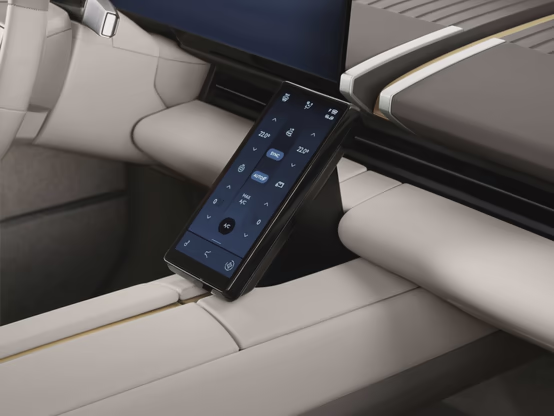
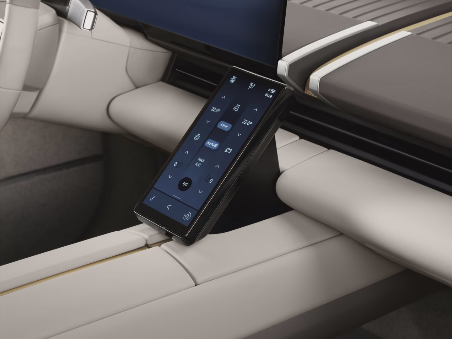
But a touchscreen for the interior controls? Really? Is it 2015 again? Physical buttons are better. I would even go so far as to say they’re necessary for any controls that a driver might operate while driving - they should be findable by feel only, in the dark, while your eyes are on the road. A luxury vehicle design should certainly have physical controls, even if they’re tucked behind one of these panels to preserve the look of the interior:
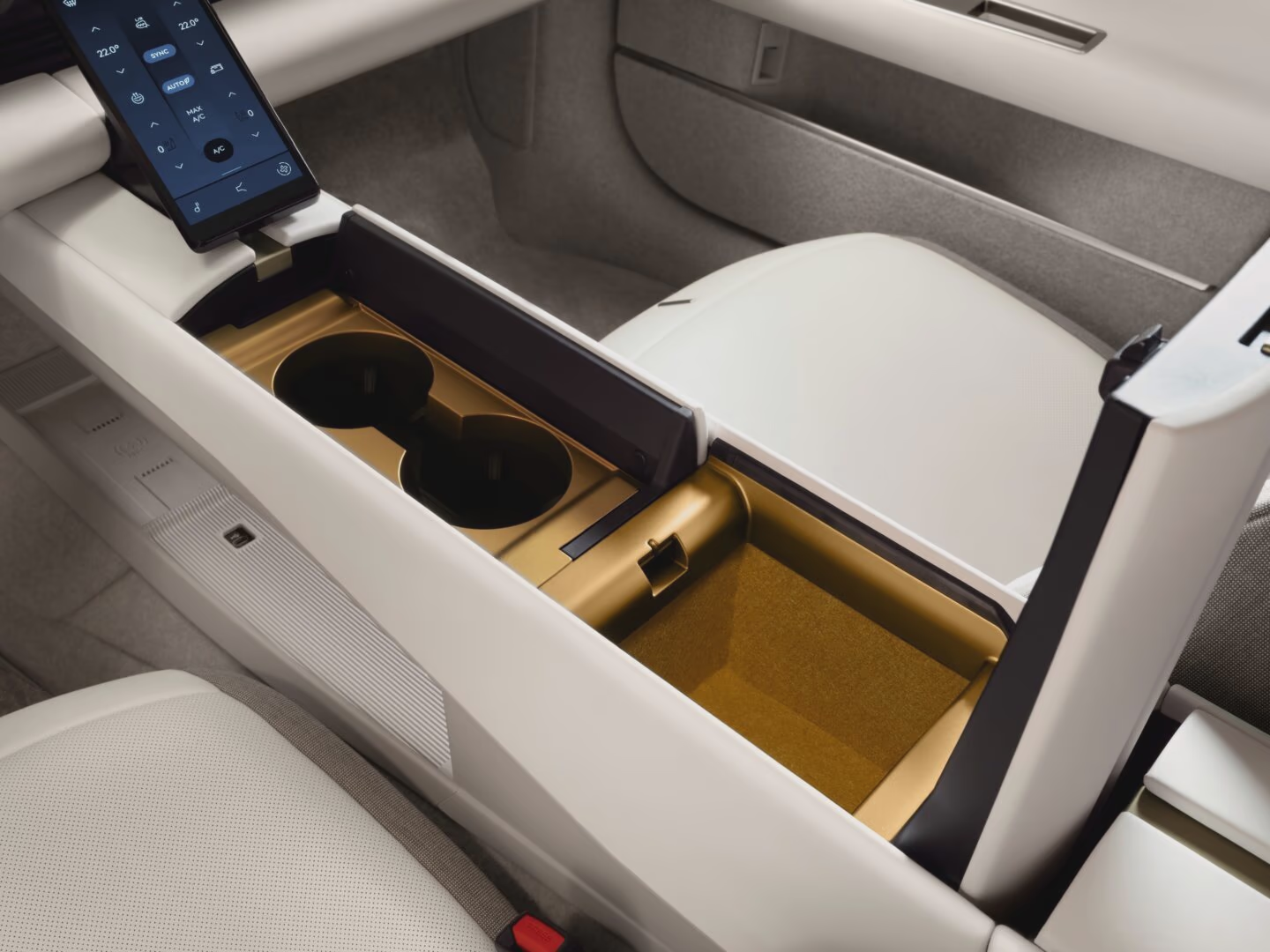
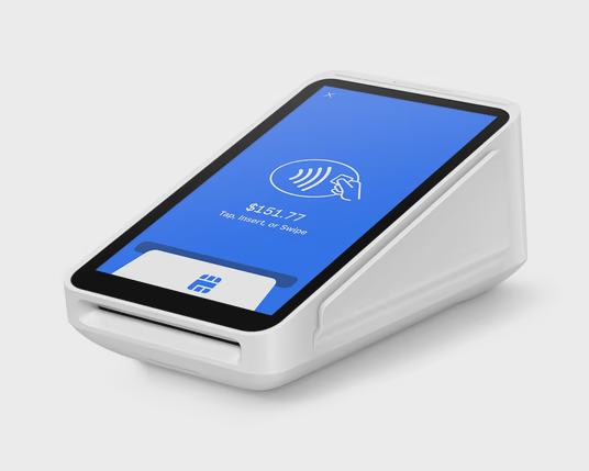
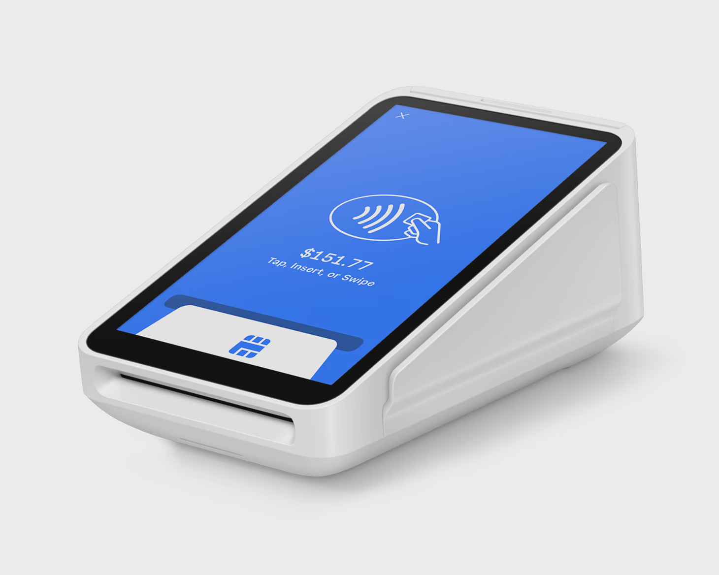
That thing that looks like a phone bolted onto the center spine is just ugly. It sticks out from the rest of the interior design like a flashing neon sign of cost-cutting. It looks like a POS terminal, like I’m about to pay for my coffee:
What a bad decision, or probably chain of bad decisions made through several committee meetings.